Case Study - UX Design
The Project
Antártica’s e-commerce website looked outdated, lacked accesibility, and was loaded with information. In this case study, I proposed a complete redesign, addressing accesibility principles and information architecture.
Role
UX/UI Designer
Tools
Figma, Adobe Photoshop
The client
Antartica Libros is a Chilean Bookstore chain and one of the biggest book sellers in the country.
The problem
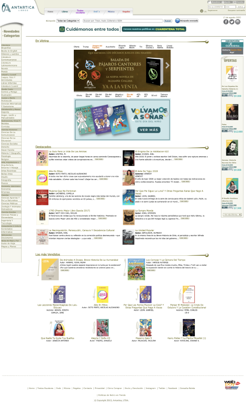
As a consequence of the pandemic, the client wanted to increase their online sales. However, their website did not perform well because users would not stay long enough to buy their products.
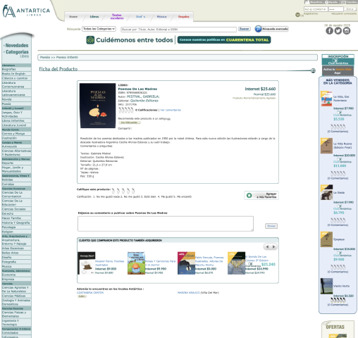
Antarctica’s website lacks accessibility, due to the fact that the information presented is very small and that makes it hard to read. Another problem is how the information is presented: The information is given almost all at once, making it difficult for the user to make a decision or know where to navigate.
The research
Defining scope of the project
Three main requirements: 1) Better UI: A place for offers, for advertising the membership, for recommendations 2) Better accessibility: Bigger images and content 3) Better IA: Less visible information on the main website, and a better organization of content
Deliverables
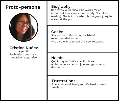
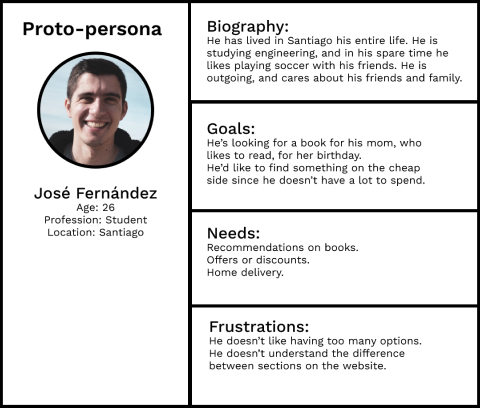
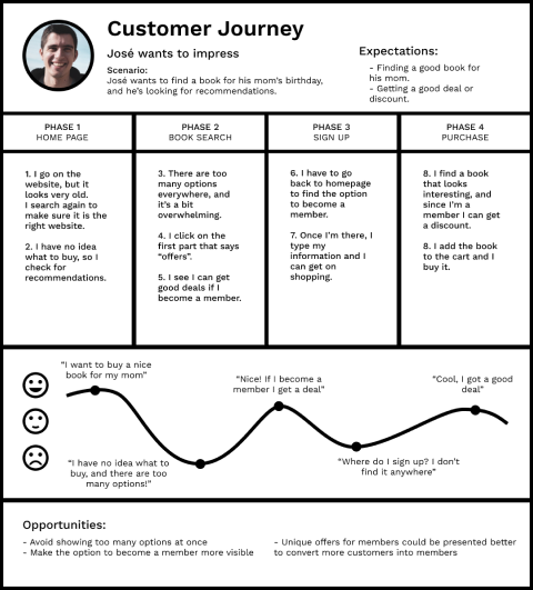
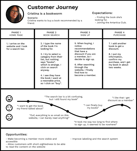
I started the research with a basic proto-persona. I had in mind two types: One for users that would visit the website because they already know what they want, and another one for users that don’t know exactly what they want, so they visit the website expecting to find recommendations or incentives.
Customer Journey
Based on these personas, I created some customer journeys to see how they would go about finding what they were looking for, and whether their expectations were met.
Accessibility guidelines
The main focus of this research was to find a way to solve the problem of readability. The typography, layout, and contrast were not helping people with visual disabilities read or find products on the website. First of all, I looked at accessibility guidelines from reputable sources to see if they addressed the current problem.
The first subject was hierarchy. Google’s Material Design was a great quick source to start this research. They talk about hierarchy as a way to simplify UI in order to understand it, using clear, visible elements, sufficient contrast and size, and a clear hierarchy of importance.
When it comes to legibility, they consider color, text, and contrast to be the most important factors to help users read a website’s content. They recommend using either black text on a light background, providing a guide for different types of opacity (high-emphasis text, 87%; medium-emphasis text, 60%; disabled text, 38%). With coloured text, it should be used only to draw attention, and apply selective emphasis, and it should be preserved for headlines, buttons, and links.
The redesign
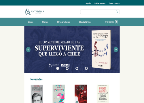
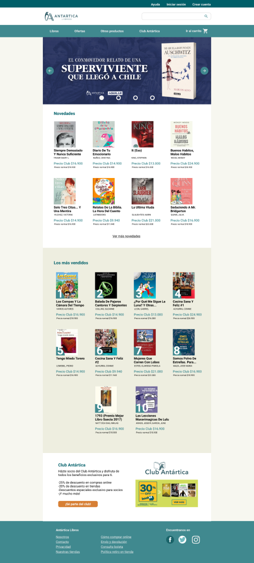
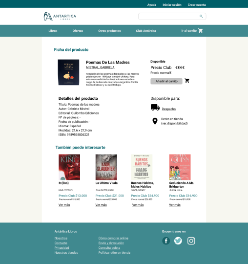
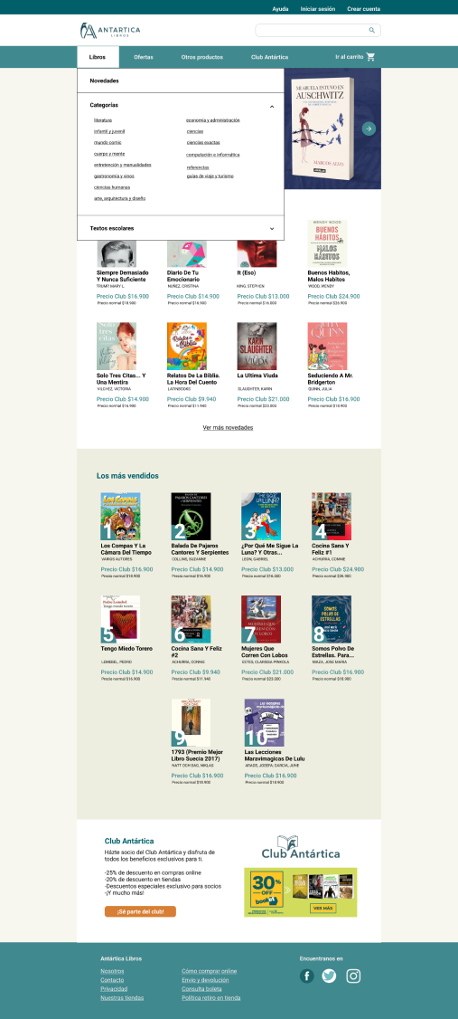
The current website contains too much information at sight. It looks crammed and everything seems to have the same level of importance. The main navigation bar contains the products that this bookstore sells, but each one has the same problem of putting all the information out there to see, without filters. It makes the user confused and creates the illusion that they won’t find what they’re looking for.
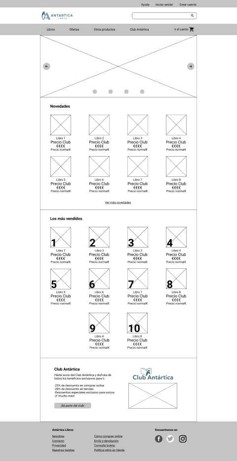
Besides the navigation bar, the rest of the sections on the website don’t seem to have a hierarchy, therefore, everything looks the same. All the links are found on each side of the website, leaving the middle space for images and subsections that are too big in comparison with the rest. There is an unbalance between elements.
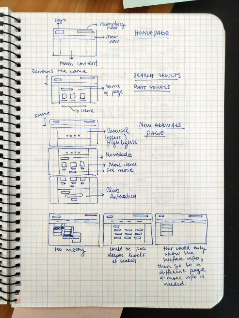
Prototyping
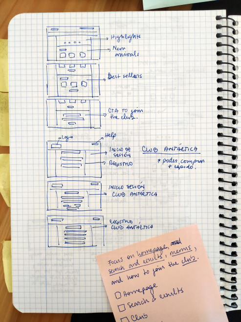
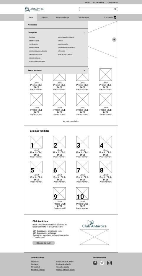
First, I tried to simplify the overall look of the website, moving the side bars to the main navigation menu. This way, the user can move through the website, discovering the currently more relevant information like new releases and highlights, but also allowing them to have other important paths such as offers or product categories at first glance.
The main navigation menu highlights the most important options available to the users. If a user is looking for something specific, they can go directly to the search bar; if they are just browsing, they have the main page for highlights, the offers tab, and the books tab, where they will gradually find the categories of books they might be interested in.
Conclusion
This study aimed to be an exercise to put into practice what I have learnt so far about UX/UI design.
I covered a few topics that arose from the original website, mainly accessibility and UI design principles. Even though there is still room for improvement, I managed to give the website better contrast, allowing users with short-sightedness be able to read more easily than before. I also tried to modify the original website so it would comply with the most important design principles, in this case, hierarchy and progressive disclosure.
Contact
We are just a few clicks away.