Case Study - UX Design
The Project
Adecco’s registration platform failed to provide users with enough feedback, so that the process would be error-free. In this case study, I proposed simple changes in user flow regarding error prevention and feedback that could improve the overall user experience.
Role
UX/UI Designer
Tools
Figma, Adobe Photoshop
The client
Adecco is a human resource company that provides temporary employment and other services such as formation and talent development, among others.
The problem
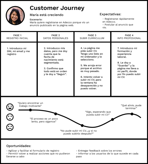
During the registration process for new candidates, the system fails to provide a way to revert or fix errors, or doesn't give enought information on how to prevent users from making them.
This is reflected in:
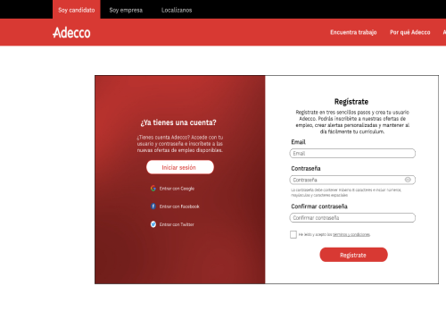
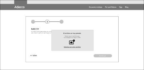
The user is asked to upload a CV after filling in a form with personal information, but if the file weights more than 5MB, not only the user can't upload the file, but also they don't get a second chance at uploading said file.
The registration form contains too many text fields that make the process longer than it should be. For instance, birth data is split in three sections for day, month, and year.
Defining project goals
With this redesign, it is expected to provide the user with more information about the registration process, so that they avoid making mistakes. Additionally, if the user does make mistakes, the redesign would allow them to start over or have a chance to redo the action.
Also, the redesign aims to make the resgitration process more efficient and smooth.
The research
Identifying the problems
After analysing the website, there were two main problems: Error prevention and forms.
The main design principles from the Nielsen Norman Group that apply to this project are the following:
No.1 Visibility of system status: It is important to tell the user what's happening during the process.
No.3 User control and freedom: Users value being able to navigate through a system that lets them undo actions or have an "emergency exit".
No.5 Error prevention: Design should prevent errors from happening, either by giving useful information about an action or by validating said action.
No.9 Help users recognize, diagnose, and recover from errors: If an error occurs, inform the user about this error and suggest ways to help them solve it.
The redesign
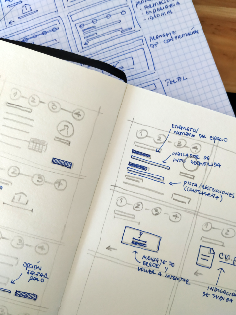
Sketches and wireframes
Errors: The main focus of this redesign is to minimise errors during the registration process. This includes error messages, undo or skip actions, or modify information later on.
Forms: This would include relevant information about each step, and it would be easy to use.
Prototyping
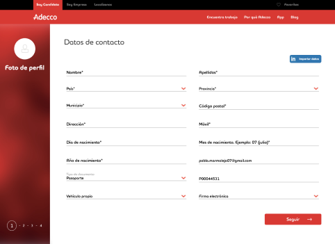
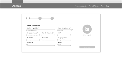
The text fields were reduced by grouping similar fields, such as name and last name, and birth information.
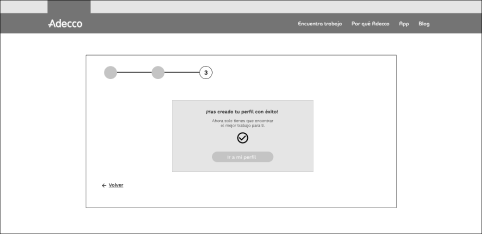
The steps or the progress bar was relocated to a place where was easier to find.
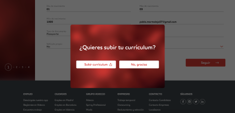
Uploading the users' CV was a critical step during the registration process. The original design didn't include this as part of the process itself. In this redesign, it was added as another step, we gave information to prevent errors, messages to inform if errors occured, and options to redo an action.
Conclusion
This redesign is a case study of how to solve the problems that the original website presented.
We addressed problems such as error prevention, giving the user more context about the process. This allowed them to know what to expect, and know what to do when an error occured. It was a first glance at UX research.
Contact
We are just a few clicks away.